
Color

A Prism
reveals your true colors
The biggest hurdle I had to overcome when starting this project was reevaluating what I knew about color. When you live in a digital world all the time like I do you can only see in terms of light. I knew that the ultimate goal was to print this deck, so I took a step back to learn about gamut and printer profiles and all that technical stuff that can be a little creatively stifling, but is so important to realizing a tangible vision on paper.
I'm so excited for that...but one step at a time.
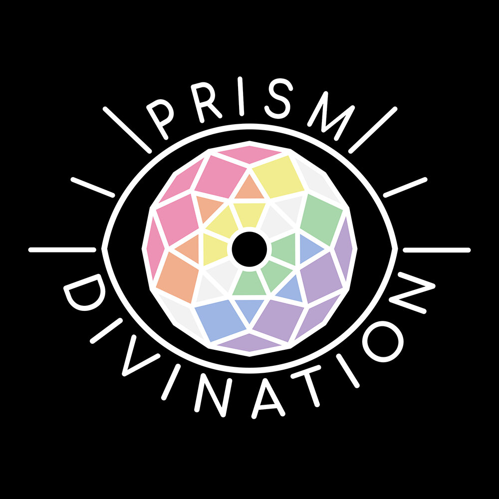
The above image is my current design for the card back. It displays a gradient of the main color palette I will be using throughout the cards. The contrast of color on stark white emphasizes the theme and foreshadows what you will find on the other side.
Aside from being a visual representation of the prism concept, the colors have meaning to the tarot itself. Pink, green, blue, and yellow represent the suits of the minor arcana; wands, pentacles, cups, and swords respectively. Though they are all separate, the addition purple and orange allows them to connect. Purple is a representation of wisdom, spirituality, and inspiration; orange represents enthusiasm, energy, and emotional healing. All the colors are needed to acheive a full spectrum of understanding.
I want to emphasize from the beginning that nothing I post on here is final. I'll tell myself it is, but by the time I'm done with this so many things will happen and changes are bound to occur.
The Wheel of Fate is always turning.
